手机外观样式
CSS
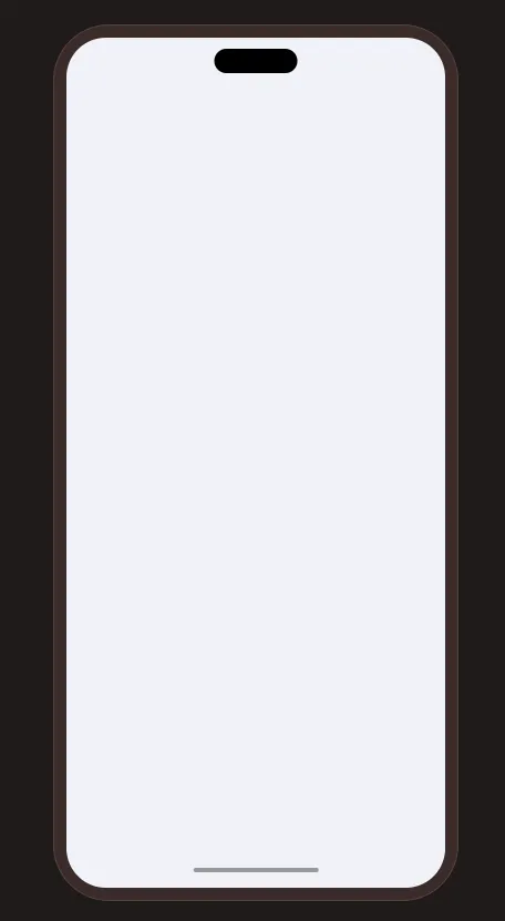
可以用于展示移动端网页的样式。
效果
实现
phone-shell手机外壳phone-vp手机视口phone-content手机内容 (可以替换为iframe元素)
<!doctype html>
<html lang="zh">
<head>
<meta charset="UTF-8">
<meta name="viewport"
content="width=device-width, user-scalable=no, initial-scale=1.0, maximum-scale=1.0, minimum-scale=1.0">
<meta http-equiv="X-UA-Compatible" content="ie=edge">
<title>phone</title>
<style>
html, body {
margin: 0;
padding: 0;
width: 100%;
height: 100%;
background-color: #201a19;
}
body {
min-width: 422px;
min-height: 876px;
display: flex;
flex-direction: column;
align-items: center;
justify-content: center;
}
.phone-shell {
/* shell */
position: relative;
width: 390px;
height: 844px;
padding: 12px;
border: 1px solid #534340;
border-radius: 54px;
background: #3b2c2a;
flex-shrink: 0;
box-sizing: border-box;
&::before {
content: '';
position: absolute;
z-index: 10;
top: 22px;
left: 50%;
width: 80px;
height: 24px;
border-radius: 999px;
background: #000;
pointer-events: none;
transform: translateX(-50%);
}
&::after {
content: '';
position: absolute;
z-index: 100;
left: 50%;
bottom: 27px;
width: 120px;
height: 4px;
border-radius: 999px;
background: #999;
transform: translateX(-50%);
}
.phone-vp {
/* viewport */
width: 100%;
height: 100%;
border-radius: 38px;
background-color: #ffffff;
overflow: hidden;
}
}
.phone-content {
/* your content */
width: 100%;
height: 100%;
background-color: #f0f2f9;
}
</style>
</head>
<body>
<div class="phone-shell">
<div class="phone-vp">
<div class="phone-content"></div>
</div>
</div>
</body>
</html>